


Gone are the days when mobile phones were only for calls and texts, as this pocket-sized device has revolutionised the way we do things.
Responding to an email while waiting for your coffee? Yes.
Doing a video chat while buying groceries? Definitely.
Setting for a doctor’s appointment using your phone? Absolutely.
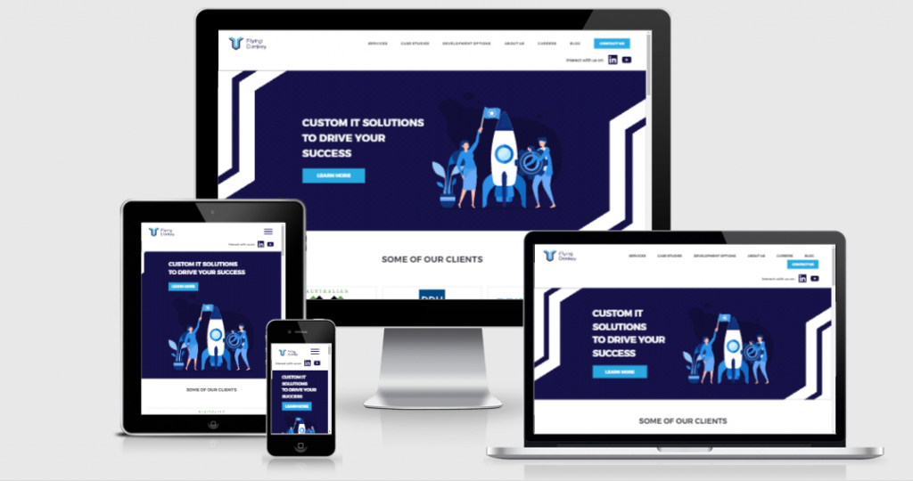
The rising numbers of mobile users have shaped the way web designers bring to life the looks and functionalities of a web page. It becomes more responsive to users’ behaviour, which allows them to experience a pleasurable journey. Whether they are using their phone, laptop, desktop, tablet or other devices, they access the site without much trouble.
As a SaaS product builder, we’ve seen the value of a captivating web design and how many SaaS companies invest heavily in it to increase their ROI and maintain a higher conversion rate.
In this article, we will share what responsive web design is and why it responds to the pressing needs of modern times.
What is a responsive website design?
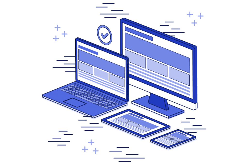
Responsive web design (RWD) refers to the modern way of permitting pages and websites to smoothly display content on all devices and screen sizes.
Rather than relying on a set of fixed screen sizes, websites easily detect the size of the device being used and adjust accordingly, resulting in an excellent user experience. With this, you don’t need to stick to one device to consume information, finish an important task, or go on with your life.
A responsive web design intends to respond to the ever-changing state of a user. A user’s device may change its behaviour, platform, orientation and size and that’s fine.
A responsive website design makes sure that you feel comfortable when you land on the web page. To achieve a responsive website design, designers set element sizes in relative units ( % ) and implement media queries to keep their designs more adaptable to different browser sizes and ensure content consistency regardless of the device used.
The importance of having a responsive website design
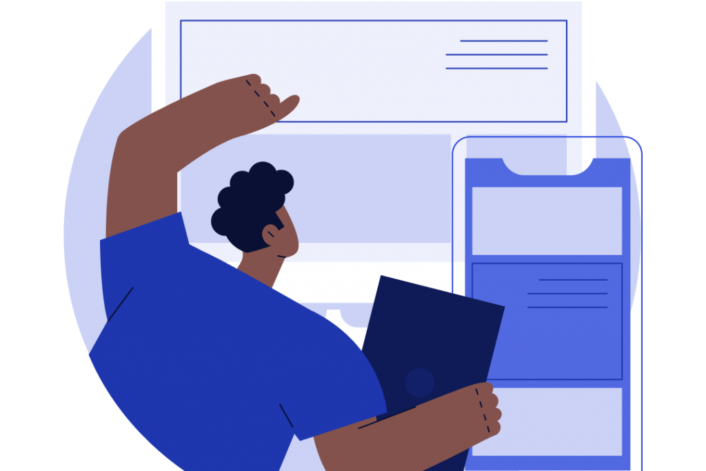
If you have a responsive web design, you maximise your chances of presenting your content to a wider audience using different devices.
A responsive website design indicates an awareness of the taste and appeal of different users. Some may visit your site while they are on a bus ride to their office, or other users may land on your website while they are sitting at their computers, and these moments give you more room to pull them into a space where they see your products and services.
If you fail to make a pleasurable user experience, it will surely hurt your business.
In fact, Google reported that 61% of users were unlikely to come back to an unresponsive and slow website. This indicates that every user who exits from your website is a loss of potential customers to whom you can offer your products and services.
As a result, when a user doesn’t find the right thing at first search, 40% of them opt to find that product or service on their competitor’s site.
You see, there are many ways to consume information and it is no longer restricted to a single device. If you capture the interest of your potential users, they may come back as a regular audience and the chances of converting them into purchasing customers are at an all-time high.
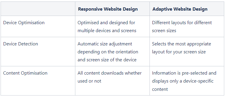
Responsive vs. adaptive web design
Adaptive design has different fixed layout sizes, whereas responsive design changes the design pattern to fit the screen size available. When the site finds free space, it chooses the best-suited layout for the screen.
As a result, when you open a browser on a desktop, the site selects the optimum layout for that screen size; resizing the browser has no effect on the design.
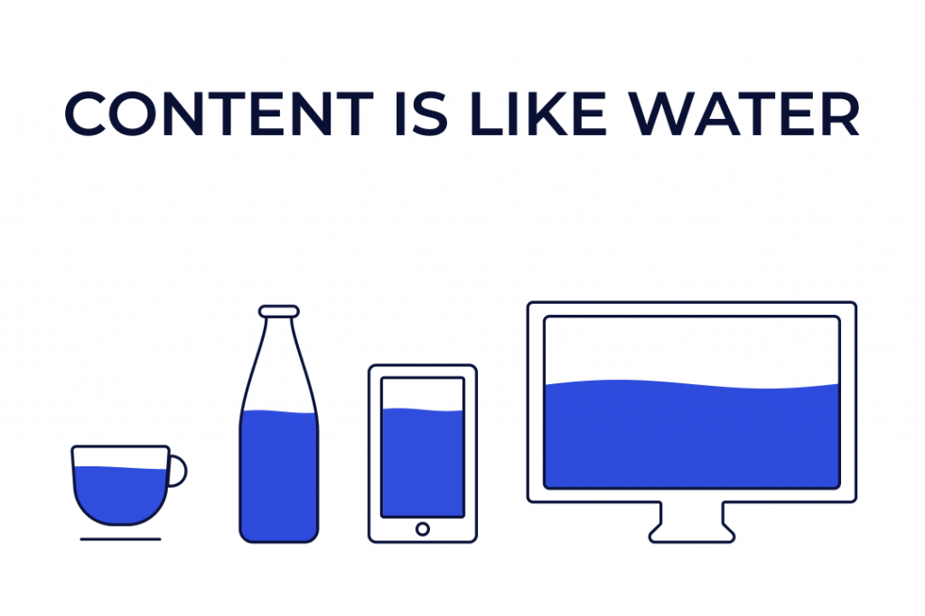
Meanwhile, responsive web design offers a more flexible design compared to adaptive design as it configures itself based on the available screen size. It was coined a “fluid” design for a reason. It’s shapeless and it follows the shape of its containers.
Likewise, the content displayed on a responsive website flows like water, ready to fill the screen size of the users without affecting the user experience.
You don’t need to zoom in and zoom out to read the content of a site if it’s a responsive site, unlike in adaptive design where you may not really fully read the text or it’s too big for you to focus on reading.
Benefits of responsive site design
1. SEO-friendly
One of the major benefits of having a responsive website design lies in its high chance of being indexed by search engines. A responsive website welcomes all users and delights them with content that keeps them engaged.
If you run an e-commerce store and your landing page responds well, there’s a higher chance that you captivate a potential buyer to scroll for the items they like.
Depending on the strength and effectiveness of your call to action, it would generate sales or leave a promising impression for them to come back.

For Google, website responsiveness contributes to how high a site can rank in a search engine. They make sure that those who appear at the top serve the users with the most useful content that gratifies their journey when making searches on the internet.
Unfortunately, the slow and unresponsive sites get buried at the bottom of the searches. It totally makes sense. Who loves a site that takes forever to load an image?
2. Better User Experience
Responsive website design allows users to freely glide into the website and use every functionality in it with ease and comfort. Hence, it improves the user experience as they find the site engaging enough to pour their attention into using the site.
In contrast, if they experience a disconnect from one device to another, they surely won’t take the time to zoom in and out just to view the content on your site.
3. Increased exposure to a broader range of users
According to traffic statistics, mobile devices account for roughly 79% of all global web traffic. In fact, this accounts for more than half of all Internet traffic worldwide. This demonstrates how having a website that renders properly on all mobile devices is becoming increasingly vital.
You will notice a rise in the number of visitors to your website as well as the length of time they spend on it once you implement a responsive design.
4. Highly responsive site
If a website takes more than three seconds to load content, then it’s a sign that your website is not responsive. Users will immediately leave if a site is slow, especially in our modern age when people rush a lot and every second counts.
Fortunately, a responsive website loads faster even if it’s loaded on different devices. The fluid grids and responsive images make the content lightweight and easier to read.
5. Higher Conversion Rates
A responsive site is like an organised store wherein the moment you enter, you just casually pick up some items on your cart and go to the counter to check them out.
Hence, when your site is responsive, your visitors just swiftly skim into your content, feel enchanted by it, and do something that favours your business. Either they sign up for your e-mail list, inquire further about your products and services, or buy the products directly from you.
In effect, a seamless and pleasurable user experience improves conversion rates.
6. Better Tracking
In a responsive site where it is easier to be indexed by search engines, it is much simpler to track your users’ behaviour through website analytics. Here, you see the pattern of the bounce rate, the conversion rate, and other important aspects of user experience that tells you how to strategise your next move.
7. Quicker Web Development
Before, adaptive web design followed the practice of separating the mobile version of their website if a smaller screen size was known. It takes a lot of resources compared to responsive websites which totally reduce the development time.
8. Easier Maintenance
Separate desktop and mobile websites demand more testing and support. Your development team will undoubtedly have to allocate time and resources to successfully handle two different versions of your website.
Unlike with a responsive website, your development team only needs minimal resources to maintain your website.
9. Lower Bounce Rates
The bounce rate tells you the percentage of visitors who exit from your website after viewing only one page. A higher bounce rate means your page fails to grab their interest either because of slow loading time, unsatisfactory content, or distracting ads.
Since responsive web design capitalises on the fluidity of displaying content, it contributes to lowering bounce rates by giving visitors an engaging user experience. An entertained user stays longer on your site because they find value in the content that they consume on your site.

10. Organised Content
Since a responsive website design has only one template for all devices, you don’t need to display different versions of your site. You let search engines focus on what’s inside of your website, which simplifies content indexing.
Unlike adaptive web design, there are other versions of your website which need duplicate content. This hurt your chances of climbing the search rankings as it may confuse the web crawlers as to which content is relevant. In effect, both versions fall into the lower part of the search rank.
Tip  : To improve search rankings of both versions, you need to prepare two sets of different SEO strategies. However, just be prepared for the additional costs demanded by this strategy to pull off.
At Flying Donkey, we believe a responsive website design takes away the hassle of preparing different SEO strategies.
11. Opens More Gateways For Social Sharing
Have you ever read a highly engaging blog that made you want to share it without a second thought? That’s the power of a responsive web design.
The strategic placement of share buttons makes it simple for users to share embedded links even on devices with small screen sizes. By letting all the visual elements and text flow naturally, you enchant your audience to widen your reach through social media sharing.
Hence, wider reach means an increased likelihood of spiking website traffic and higher conversion rates. In addition, once Google finds a surge in engagement on your website, it will positively enhance your search engine rankings.
How to Build a Responsive Website?
After reviewing the scope and analysis of the project, UX designers decide what kind of site structure to proceed with. They prepare information architecture and a sitemap.
The emergence of the site map shows us how to prepare a responsive web design. It tells us whether this website will have one page or multiple pages.
After this step, they will start to prepare wireframes of the mobile, tablet, and web screens for responsiveness. Here, users will see which content is on which page and what actions they should take. Then, they will pass the UX Design steps and check if it’s appropriate on the users and client-side.
The most crucial issue on the UI Design side is the creation of the grid system. The grid system will create integrity with the customer’s brand. The grid system here needs to be prepared separately for mobile, tablet, and web screens. The grid systems help designers place content in areas that make it readable and easy to navigate.
In addition, the grid system allows UI designers to ensure that the content pops even in small screen sizes like in mobile phones.
The goal here is to communicate a clear message to your user, even in just one glance. As mentioned, with the creation of a good grid system, information architecture and user flows need to be established and progressed.
Is there an industry practice to know web design responsiveness?
After the development is done, the site is now ready for examination. By doing so, we determine the page responsiveness according to the metrics set by Google PageSpeed Insights. However, the process here emerges from the unity of design and development.
The possibilities offered by Google show the responsive compatibility of the site we designed and developed together. With the rates it gives us, we see how responsive our site is. In addition, by completing the developments according to the rates it has issued, we both increase the responsiveness of Google and bring us to the fore.
At Flying Donkey, we believe in the value of continuous improvement and we tested the previous version of our website in terms of website responsiveness in mobile device and desktop view.
In terms of mobile compatibility, it’s at a low level according to Google’s report. When we examine the details below, it shows in which steps we can get stronger by developing.
The report here is usually left for the review of the developers, but the report here subjects articles for the designers. It shows the development content, but here it offers suggestions related to the suitability of designs for mobile responsiveness.
Compared to mobile, it has a better rate, but when we look at Google’s expectations and the possibility of going up, it remains proportionally low.
If we just want to examine whether it is responsive in terms of design, we need to look at the screens designed for this.
Testing Tools for Site Responsiveness
Before showing your site to the world, you should test whether it is responsive or not to lessen the problems you need to look out for in the future.
At present Hotjar and Google Analytics are some of the most popular tools to test site responsiveness. Through these tools, we create surveys that trigger and communicate with users instantly.
How HotJar Works
Hotjar helps us to identify “who” visits the website and “ what” exactly they do. Hotjar gives us a tool for analysis and feedback. Through this, it helps us to increase the performance of our website and improve the user experience.
The feature that Hotjar offers us the best in terms of user experience is the heat map. It shows the points that users focus the most or least focus the most or least focus on while browsing mobile, tablet, and web pages. This enables us to know our users more and it allows us to pour our efforts in improving the website relative to users’ needs.
Along with the heatmap, another important point is the number of visitors and the time they are session recording time. It’s also possible to monitor how users behave and navigate on the website full time. In this way, it’s also possible to watch instantly on the site. Whether you are on a live site or A/B testing, it provides a guided observation to get user records.
Recordings empower designers to review previous actions and it permits strong documentation of the notes and tags taken. On top of that, these points are shareable with wider people, and they can be examined as well.
A user, in particular, is formed. Some form creation or custom-related posts created by Hotjar will fit well. Also, Hotjar allows us to see when, where and how many of these forms are filled. To have learned the information about filling out the forms.
Google Analytics has similar features to Hotjar. The majority continues with Hotjar, just because they have progressed differently in terms of pricing.
Other Tools
Inspect Tool on Chrome
The first tool you should try when testing the responsiveness of your website is just within your Chrome browser. As part of the feature in the inspect element tab, just right-click on your website and click “inspect“.
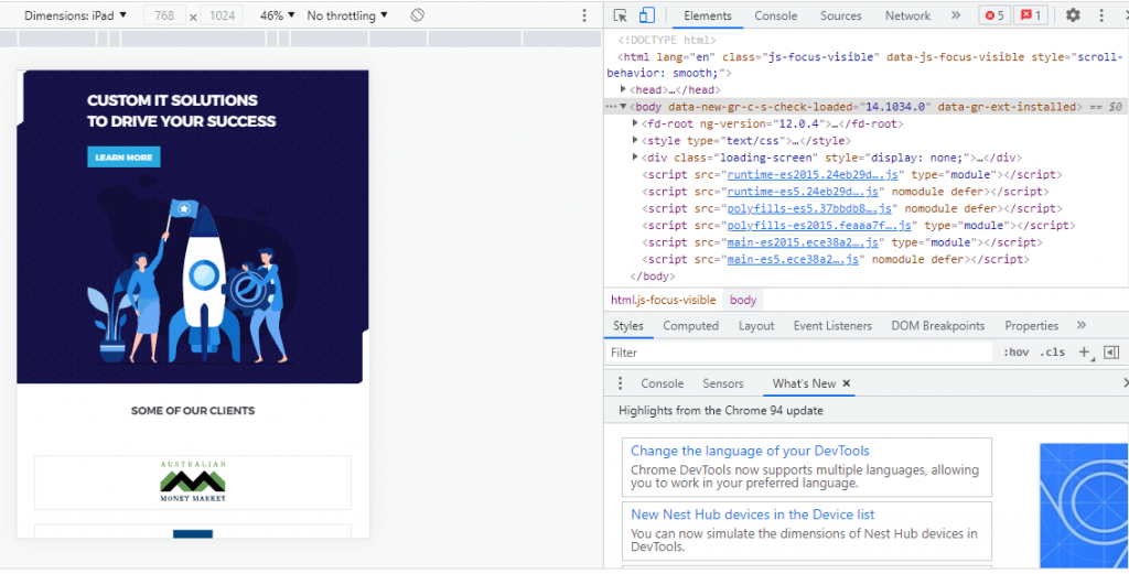
Click ‘Inspect’ on any website by right-clicking it. When the inspect window opens, you’ll notice a device icon next to the ‘Elements’ button or “toggle device toolbar“. When you select the devices button, your screen displays the current webpage at various breakpoints and you can check your site responsiveness from different mobile devices.
Responsinator
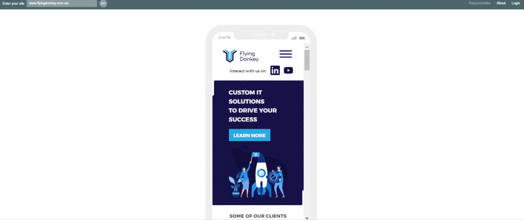
Responsinator is another well-loved site responsiveness tool because of its straightforward approach. Just add your URL and it will display your site on a variety of mobile devices. Check for breakpoints if the orientation of mobile devices is changed. This tool works best if you only need quick checks to see if your site loads fine.
Am I Responsive
Am I Responsive works in a similar way to Responsinator in that it displays the test site on a variety of devices. Each screen can be scrolled separately.
Responsive Web Design Tester
Responsive Web Design Tester is a browser extension that lets you select from a list of presets and then your site will open in a new window with your prefered viewport size.
Are Responsive Websites Still Relevant?
Definitely, at the moment, responsive web design is still among the most important user interactions we have.
When users want to research something due to their habits, they first proceed by researching the browsers on the phone, tablet, or computer. This shows us that users are still on their websites and that we convey the first impression through the website.
It informs us on which platform we should stand by looking at the traffic rates of its website. When we didn’t do a responsive website, it looked the same on tablet and mobile as web design was, which reduced readability. We have a pre-built website and if we are renewing it, it will allow us to observe which platform has more traffic and to focus on that platform.
Another factor is SEO. Along with a better user experience, it increases its SEO effort on all platforms. If we look at the advantages;
 Users will be able to access the same content with the same flow when they visit it on any platform and then visit it again from a different device.
It can be easily controlled. It does not need multiple updates or approval processes.
Future measurement is possible. When it is desired to add or remove a feature tomorrow, it instantly measures how effective or less effective these contents are, and at the same time, it integrates quickly.
Here’s How Flying Donkey Can Help
Your website serves as your storefront on the internet. It’s a challenge to invite them to take a look at what’s inside your business and what kind of products and services you offer.
If ever you got the chance to convince them to visit your website, your web design should do all the hard work of guiding them towards a pleasurable user experience.
At Flying Donkey, we always stay committed to building business owners a website that doesn’t only serve looks but also value and innovation.
Almost all websites use a responsive web design approach and it’s not too late to give it a try.
Reach out to us if you want to build your responsive website today. Promise, we will always respond.